
Green has moved beyond accent walls and houseplants. In 2026, it’s become the go-to color for homeowners looking to transform their bedrooms into restful retreats. The reason? Science backs what designers have known for years: green reduces stress, improves sleep quality, and creates visual balance in ways no other color manages. Whether someone’s working with a cramped secondary bedroom or a spacious primary suite, green adapts. This guide walks through the practical side of green bedroom decor, from picking the right shade to selecting materials that’ll actually hold up over time. No fluff, just the decisions that matter.
Key Takeaways
- Green bedroom decor reduces stress and improves sleep quality due to how the human eye processes its middle-spectrum position, making it the ideal color choice for restful spaces.
- Light greens like sage and mint work best in small bedrooms with limited natural light, while dark greens like forest and emerald require strong lighting and ceilings of 9 feet or more to avoid a cramped feel.
- Proper paint preparation, including sanding glossy surfaces, filling imperfections, and using a gray or white-tinted primer, ensures professional results in your green bedroom project.
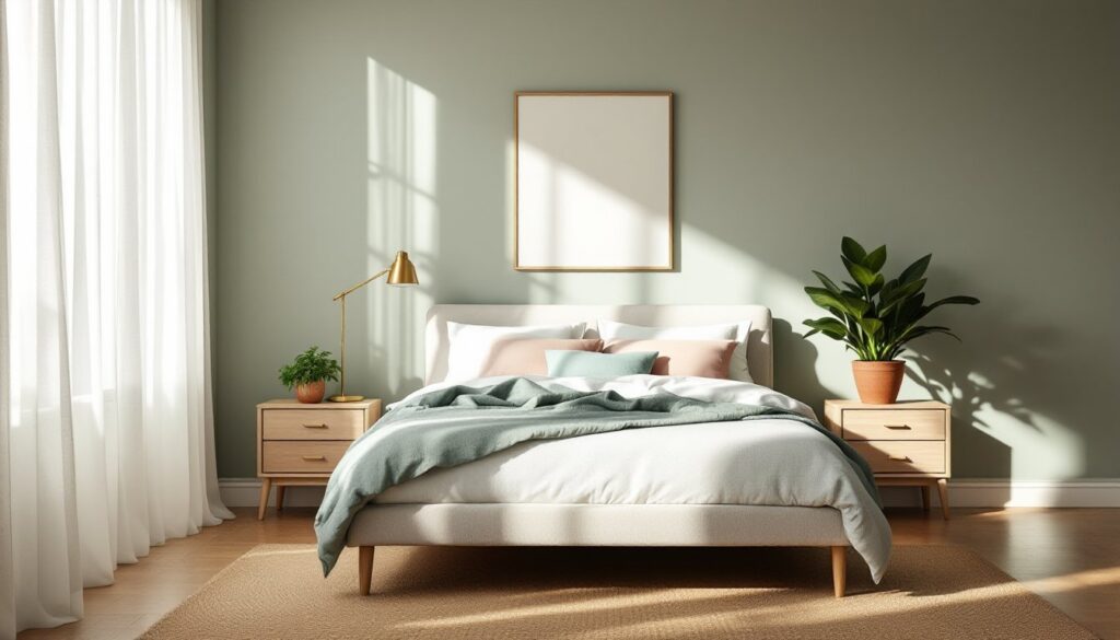
- Layer green bedroom decor through textiles like throw pillows and curtains in complementary tones rather than painting all walls, allowing seasonal adjustments and easier changes.
- Pair green walls with accent colors like white, cream, wood tones, or navy to prevent the space from feeling one-note; avoid mixing warm and cool green shades in the same room.
- Green bedroom designs adapt to any style—from Scandinavian minimalism with pale sage to bohemian with layered greens—and pair well with strategic lighting to balance mood and atmosphere.
Why Green Is the Perfect Color for Your Bedroom
Green sits in the middle of the visible light spectrum, which means the human eye processes it with less strain than warmer or cooler extremes. That’s not design theory, it’s biology. The result: walls painted green don’t compete for attention the way a bold red or stark white might.
Beyond the science, green connects to nature without requiring a window overlooking a forest. It brings the calming effect of outdoor spaces inside, which matters when someone’s bedroom doubles as a home office or faces a busy street. Studies on color psychology consistently show that green environments lower heart rate and promote relaxation, making it ideal for spaces meant for rest.
Green also offers remarkable versatility. A soft sage works in a minimalist Scandinavian bedroom, while a deep emerald suits traditional or maximalist styles. Unlike trendy neutrals that feel cold or dated within a few years, green has staying power. It’s been used in bedrooms since Victorian times and still feels current in 2026.
For DIYers concerned about resale value, green is a safe bet. It reads as sophisticated rather than polarizing, and it photographs well, important when listings hit the market. Light to mid-tone greens especially appeal to a broad range of buyers.
Choosing the Right Shade of Green for Your Space
Picking the wrong shade wastes time and materials. Start by testing paint samples on at least two walls, one that gets direct light and one that doesn’t. Green shifts dramatically depending on natural and artificial light sources. A soft mint might look fresh in morning sun but turn icy under LED bulbs at night.
Light greens (sage, mint, celadon) work best in small bedrooms or spaces with limited natural light. They reflect light rather than absorb it, making rooms feel larger. These shades pair well with white trim and light wood furniture. Coverage typically runs 350-400 square feet per gallon for quality interior paint, but porous drywall may need a tinted primer first.
Mid-tone greens (olive, fern, eucalyptus) suit medium to large bedrooms with decent natural light. They add warmth without overwhelming the space. These shades hide minor wall imperfections better than lighter tones, a practical advantage in older homes where walls aren’t perfectly smooth.
Dark greens (hunter, forest, emerald) create drama but require commitment. They absorb light, so bedrooms need strong natural light or well-planned artificial lighting. Use these in rooms with ceiling heights of 9 feet or more to avoid a cave-like feel. Dark colors also require more coats, budget for three coats instead of the standard two.
Test samples for at least 48 hours before committing. View them in morning light, afternoon light, and under bedroom lamps. If the shade looks good in all three conditions, it’s a winner.
Essential Green Bedroom Decor Elements to Transform Your Room
Walls and Paint: Setting Your Green Foundation
Walls set the tone, but the prep work determines whether paint looks professional or amateur. Sand glossy surfaces with 150-grit sandpaper to help primer adhere. Fill nail holes and cracks with spackle, then sand smooth once dry. Skipping this step shows through even the best paint.
Primer matters more with green than neutral colors. Use a gray-tinted primer under cooler greens and a white primer under warmer shades. This prevents underlying wall color from skewing the final result. If painting over a dark or bold color, a primer-sealer combination saves time.
For walls in good condition, a satin or eggshell finish offers durability and subtle sheen. Flat paint hides imperfections but doesn’t clean well, a problem in bedrooms where hands touch walls near light switches and door frames.
Alternatives to full-wall paint include peel-and-stick wallpaper in green patterns (botanical prints, geometric designs) or a single accent wall in a darker shade while keeping other walls neutral. Removable wallpaper works for renters or anyone testing a bolder look before committing.
Safety note: Work in a well-ventilated space. Open windows and use a box fan to exhaust fumes, even with low-VOC paints. Wear a dust mask when sanding and eye protection if painting overhead.
Textiles and Bedding: Layering Comfort and Color
Textiles soften a green bedroom and add depth without permanent changes. Start with bedding in complementary neutrals, white, cream, or tan, then layer in green through throw pillows, blankets, or a duvet cover. This approach lets someone adjust intensity seasonally.
For a cohesive look, match green tones. If walls are a cool sage, choose bedding and curtains in similar cool-toned greens or neutrals with gray undertones. Mixing warm and cool greens in the same space feels disjointed.
Curtains in green linen or cotton add texture and control light. For bedrooms needing blackout capability, use a neutral blackout liner behind green curtains rather than heavyweight green fabric, which can overwhelm smaller windows. Standard curtain panels measure 84 or 96 inches long: measure from rod to floor and add 2-3 inches for a clean break at the floor.
Area rugs anchor the bed and add warmth underfoot. A jute or wool rug in natural tones grounds green walls, while a patterned rug incorporating green ties the room together. For standard queen beds, an 8×10-foot rug allows the rug to extend at least 18 inches beyond each side of the bed.
Choose washable textiles when possible. Pillow covers with zippers, removable duvet covers, and machine-washable throws make maintenance realistic. DIYers often overlook this, then regret it when dust and spills happen.
Complementary Color Palettes That Make Green Shine
Green doesn’t work alone. The right accent colors prevent a bedroom from feeling one-note or reading as “too much green.”
White and cream are the safest pairings. They keep green from feeling heavy and work with any shade, from pale mint to deep forest. Use white for trim, ceiling, and larger furniture pieces. This combination feels crisp without being cold.
Wood tones bring warmth. Light woods (oak, maple, birch) suit lighter greens, while dark walnut or mahogany complements deeper shades. Real wood beats laminate, the grain and texture add depth that synthetic materials lack. Nightstands, bed frames, and dressers in natural wood balance green’s coolness.
Blush pink and terracotta add unexpected warmth without clashing. A blush throw pillow or terracotta ceramic lamp on a green backdrop feels current in 2026. Keep these accent colors to 10-15% of the room’s visual weight, any more and the palette gets muddy.
Navy and charcoal ground lighter greens. A navy upholstered headboard or charcoal throw blanket adds contrast and sophistication. This combo works especially well in modern or transitional bedrooms.
Metallics (brass, gold, matte black) add polish. Brass drawer pulls, a black metal bed frame, or gold-framed mirrors catch light and prevent green from feeling flat. Stick to one metallic finish per room for cohesion.
Avoid bright orange or red unless going for a maximalist look. These colors fight green rather than complement it. Also skip cool grays with warm greens, the temperature clash creates visual tension.
Styling Tips for Different Green Bedroom Aesthetics
Green adapts to multiple design styles, but each requires a slightly different approach.
Scandinavian/Minimalist: Choose pale sage or mint for walls. Keep furniture minimal, a low-profile platform bed, floating nightstands, simple linen bedding in white or oatmeal. Add texture through a chunky knit throw or a single houseplant (a snake plant or pothos requires minimal care). Skip clutter and decorative objects. The green should feel like breathing room, not a statement.
Bohemian: Layer multiple shades of green through textiles, an olive duvet, sage curtains, emerald pillows. Mix in natural materials: rattan headboards, jute rugs, macrame wall hangings. Add warm metallics (brass or copper) and plenty of plants. This style tolerates more visual complexity, so patterned bedding and vintage finds work well.
Traditional: Deep greens (hunter, forest) pair with dark wood furniture and classic lines. Use green on an accent wall or through wallpaper with a subtle damask or botanical pattern. Add a tufted headboard in cream or navy. Brass or antique gold hardware and sconces reinforce the traditional feel. Keep walls balanced with white or cream on three sides if using a dark green.
Modern/Contemporary: Opt for eucalyptus or fern shades. Pair with sleek furniture, a simple upholstered bed frame, floating shelves, and minimal decor. Incorporate matte black or brushed nickel metals. Keep lines clean and avoid busy patterns. A single large piece of abstract art in complementary tones (cream, blush, navy) adds interest without clutter.
Farmhouse: Soft sage or celadon works best. Combine with shiplap (real or peel-and-stick), white or distressed wood furniture, and linen bedding. Add texture through quilts, woven baskets, and galvanized metal accents. Keep it cozy but uncluttered, farmhouse style in 2026 leans cleaner than the heavily distressed look of the 2010s.
Whichever style fits, lighting makes or breaks the look. Use a mix of ambient (overhead or ceiling fan), task (bedside lamps), and accent (wall sconces or string lights) to layer light. Dimmer switches let someone adjust mood, essential since green can feel energizing or calming depending on brightness.