
A green accent wall can completely change how a bedroom feels. Whether it’s a calming sage or a dramatic forest hue, the right shade brings depth, character, and a natural connection to indoor spaces. Unlike repainting an entire room, a single accent wall offers impact without overwhelming the senses, or the schedule. This guide walks through choosing the right green, placing the wall for maximum effect, coordinating décor, and avoiding the most common missteps. With proper prep and a strategic approach, homeowners can create a bedroom that feels both restful and intentional.
Key Takeaways
- A green accent wall creates a focal point that brings calm and character to your bedroom without the commitment of repainting the entire room.
- Sage and celadon greens work best in rooms with limited light, while bold emerald and forest greens thrive in naturally bright spaces and create an intimate atmosphere.
- Place your green accent wall behind the bed or on the wall opposite the bed for maximum visual impact, avoiding walls interrupted by multiple windows or doors.
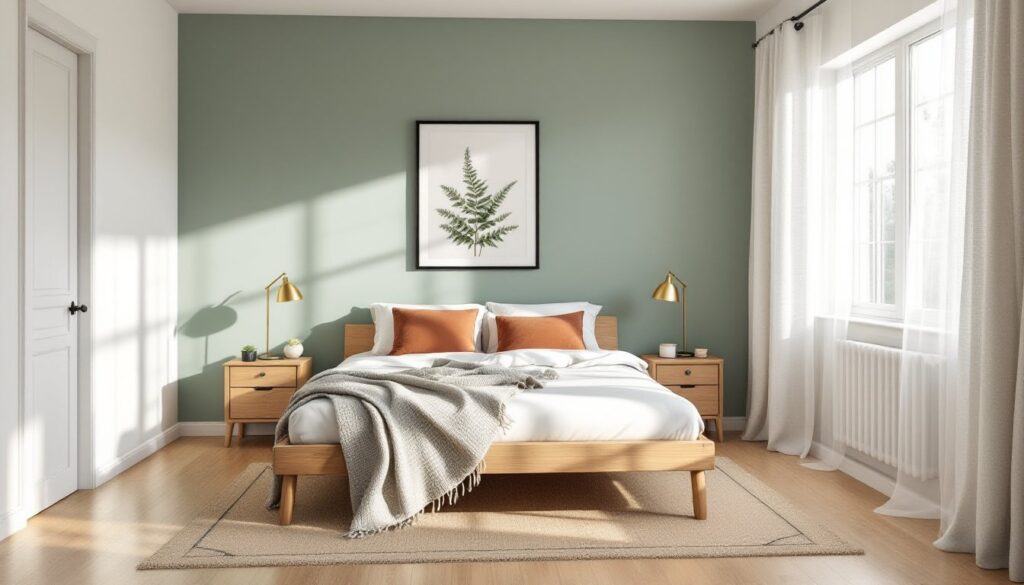
- Pair your accent wall with crisp white or ivory bedding, warm lighting (2700K–3000K bulbs), and wood furniture tones that complement the green shade you choose.
- Proper surface preparation—including primer, spackling, sanding, and painter’s tape—along with testing paint samples for 48 hours prevents costly mistakes and ensures professional results.
- Green hides wall imperfections better than lighter neutrals, and a matte or eggshell finish minimizes glare while requiring only one gallon of quality paint for most bedroom walls.
Why Choose a Green Accent Wall for Your Bedroom?
Green sits at the intersection of calm and vitality. Studies in color psychology consistently link green tones to relaxation and stress reduction, qualities that matter in a space designed for rest. Unlike cooler blues or stark grays, green carries warmth from its yellow undertones while maintaining the tranquility of its blue base.
From a design perspective, green works across styles. Mid-century modern, farmhouse, maximalist, and Scandinavian aesthetics all accommodate green when the shade and finish align with the room’s overall direction. It pairs naturally with wood tones, brass hardware, and both warm and cool neutrals.
Practically, an accent wall focuses attention without requiring a full repaint. It’s a lower-cost, lower-commitment way to test bold color. One gallon of quality paint covers approximately 350–400 square feet, meaning most bedroom accent walls need just one gallon. Prep and painting typically take a weekend, assuming the wall is in good condition.
Green also hides imperfections better than lighter neutrals. Small wall texture variations, patched nail holes, or slight unevenness become less visible in medium to dark greens, especially with a matte or eggshell finish.
Best Shades of Green for Bedroom Accent Walls
Sage and Soft Green Tones
Sage, celadon, and muted olive greens work well in bedrooms with limited natural light or smaller square footage. These shades reflect light without appearing washed out, maintaining color saturation even in north-facing rooms.
Sage green leans gray-green, offering versatility with white trim, natural linen bedding, and light wood furniture. It reads as neutral enough to avoid fatigue but distinct enough to anchor a room. Pairing sage with warm metallics like aged brass or copper adds dimension without clashing.
Celadon has a subtle blue-gray undertone. It works particularly well in rooms with cool-toned flooring (gray carpet, white oak, or tile) and pairs cleanly with crisp white or soft cream accents.
Softer greens require attention to sheen. A matte or eggshell finish prevents the color from appearing too pastel or childlike. Flat paint also minimizes glare from bedside lamps and overhead lighting.
Bold Emerald and Forest Green
Deeper greens, emerald, hunter, forest, or even near-black shades like Sherwin-Williams Roycroft Bottle Green or Benjamin Moore Essex Green, create drama and intimacy. These work best in rooms with strong natural light or where a cocooning effect is desired.
Emerald green has a jewel-tone richness that suits maximalist or eclectic spaces. It holds up against bold patterns, velvet textiles, and ornate frames. The key is balancing saturation: if the accent wall is emerald, keep surrounding walls neutral (warm white, greige, or soft tan) to avoid visual overload.
Forest green skews earthier, complementing natural materials like jute rugs, leather, and raw wood. It pairs well with terracotta, mustard, and rust accents, colors that echo its organic roots.
Darker greens benefit from a satin or semi-gloss finish in high-moisture climates, as these sheens resist mildew better than flat paints. But, satin emphasizes wall imperfections, so proper surface prep, sanding, priming with a high-quality primer like Zinsser Bulls Eye 1-2-3, and filling holes, is non-negotiable.
Where to Place Your Green Accent Wall
The wall behind the bed is the default choice, and for good reason. It creates a natural focal point without competing with windows or doorways. This placement works in most layouts and allows the bed to visually anchor the color.
In rooms where the bed sits against a shorter wall or under a window, consider the wall opposite the bed. This draws the eye when entering the room and can make a narrow bedroom feel more balanced. It’s also practical if the wall has architectural features, like a fireplace, built-in shelving, or wainscoting, that benefit from color contrast.
Avoid accent walls with multiple interruptions. A wall broken up by two windows, a closet door, and a light switch becomes a patchwork of color rather than a cohesive statement. If that’s the only option, using painter’s tape to carefully cut in around trim and openings is essential. A 2-inch angled brush helps achieve clean lines where a roller can’t reach.
In asymmetrical or L-shaped bedrooms, the longest uninterrupted wall usually works best. It creates continuity and prevents the color from feeling like an afterthought.
Always account for furniture placement. If a tall dresser or wardrobe will cover most of the wall, the accent loses impact. Measure furniture dimensions and mark them on the wall with painter’s tape before committing to a color.
Decorating Around a Green Accent Wall
Once the wall is painted, the room’s palette shifts. Bedding offers the easiest way to harmonize. Crisp white or ivory linens keep the focus on the wall, while layering in textures, linen duvet covers, cotton waffle blankets, or velvet throw pillows, adds depth without introducing competing colors.
For those wanting more color interplay, consider the complementary and analogous color rules. Green’s complement is red, but softer versions, blush, terracotta, or rust, feel less aggressive. Analogous colors (blue-greens and yellow-greens) create a cohesive, nature-inspired palette.
Artwork and wall décor should either contrast or echo the wall tone. Black-framed botanical prints, gold-framed abstracts, or natural wood floating shelves all work. Avoid overloading the accent wall itself: one or two pieces suffice. Overdecorating dilutes the wall’s impact.
Lighting affects how green reads throughout the day. Warm-toned bulbs (2700K–3000K) bring out yellow and earthy undertones, making greens feel cozier. Cooler bulbs (3500K–4100K) emphasize blue undertones, which can make some greens appear gray or washed out. Test bulbs before installing fixtures permanently.
Wood tones matter. Lighter woods (white oak, maple, birch) pair cleanly with sage and celadon. Darker woods (walnut, mahogany, espresso-stained furniture) complement emerald and forest greens. Avoid mixing multiple wood finishes in a room with a bold accent wall, it creates visual clutter.
Rugs should either ground the space in neutrals (jute, cream, gray) or pull in one accent color from the bedding or art. A patterned rug can work if green appears within the pattern, tying the floor to the wall.
Common Mistakes to Avoid
Skipping primer ranks high on the list of avoidable errors. Even if the existing wall is a light color, primer ensures even coverage and truer color payoff, especially with saturated greens. Tinted primer, matched to the finish color, reduces the number of topcoats needed.
Poor lighting evaluation leads to buyer’s remorse. Paint samples on poster board and move them around the room throughout the day. Morning light, midday sun, and evening lamplight all shift how green appears. A shade that looks perfect at noon might turn muddy or neon under incandescent bulbs.
Ignoring sheen creates maintenance headaches. Flat paint hides flaws but stains easily and can’t be scrubbed. Eggshell offers a compromise, low shine with moderate washability. Satin works in humid climates but shows every ding and scuff. Match sheen to the room’s use and the homeowner’s tolerance for touch-ups.
Overcommitting without testing is common. A quart of sample paint costs a few dollars and prevents a costly redo. Paint a 2×2-foot section and live with it for at least 48 hours before buying gallons.
Neglecting the ceiling and trim throws off proportions. If trim is dingy or the ceiling has yellowed, fresh paint on one wall highlights the contrast in a negative way. Touch up trim with semi-gloss white and consider a ceiling refresh if it hasn’t been painted in years.
Finally, rushing surface prep guarantees a subpar result. Fill nail holes with lightweight spackling paste, sand smooth with 120-grit sandpaper, vacuum dust, and wipe walls with a damp cloth. Painter’s tape should go down along trim and baseboards, pressed firmly to prevent bleed. Remove tape while the final coat is still slightly tacky for the cleanest lines.